
Workiva: Principles of Pursuit Reimagined
Reimagining the Principles of Pursuit, a crucial seller guide given to every Workiva sales team, so that sellers can properly use it as originally intended.
Build
Role: UI Instructional Designer, Intern
Team: Marketing, Sales Enablement, UI Designer, Sales
Tools: Figma, Wdesk, Workramp LMS
Why + Problem
The Principles of Pursuit is Workiva’s internal selling process. Sales Enablement teaches to every seller that joins the Sales Enablement team and sales managers regularly refer to it to keep track of deals.
However, the way the current Principles of Pursuit guide was designed was unreadable. It was overloaded with information, difficult to navigate, and confusing. Thus, the Sales Enablement UI team was tasked with completely rethinking how Training Mangers could teach and refer to this essential selling process.
The Original Design
This was the main bulk of the “cheat sheet” intended for sellers to refer to. However, there is far too much information in these charts and the organization of the information is diffiuclt to navigate.
Sellers undoubtedly have a heavy workload, reviewing similar text heavy documents daily and meeting with managers and clients. How would anyone expect a seller to take time out of their day to refer to this selling guide that is supposed to help them but only prompts further confusion?


Research
Personas


Information Architecture


The Cheat Sheet Design

First Draft
This design was the first take on the cheat sheet portion of the Principle of Pursuit redesign. Although slightly more organized than before, there is still far too much information and it was clear that we need to take out information that was not necessary.

Second Draft
After reviewing the information the Sales Enablement team, sellers, and managers, we managed to drastically simplify the content and keep only the most important and actionable items. Furthermore, we edited the writing to be more concise adhering to the how research states a 6th grade level of reading is best for instructions.
Let’s think outside the box!
While the cheat sheet became more simpler and clearer, a chart with text in it is not that different than what sellers are seeing everyday. We wanted to take this a step further and brainstorm how could we make this more visually engaging to increase understanding of the Principles of Pursuit.
Anyone up for a game of Workiva?
This was the first “outside the box” design I came up with inspired after the Monopoly gameboard. New Hire Training, the training where new hires sellers are taught the Principles of Pursuit, lasts a week 5-8 hours each day. While there is some training activities, much of the training revolves around the training manager walking new hires through a 300+ slide deck. Training managers came to the UI team asking us how we might increase participation. Thus, since the Principles of Pursuit is a sales process, we thought a gameboard type of design would be appropriate and fun.


This design is based off of Candy Land where the path is more straightforward the text is easier to read because it is upright.
While these initial design received positive feedback, if these board games were to be actually used as gameboards, the rules of the game and practical parts of it would have to be designed and since New Hire Training is already so packed and dense with material to fit within a week, now wasn’t the right time to continue with a more complex gameboard design.
We can simplify even more!


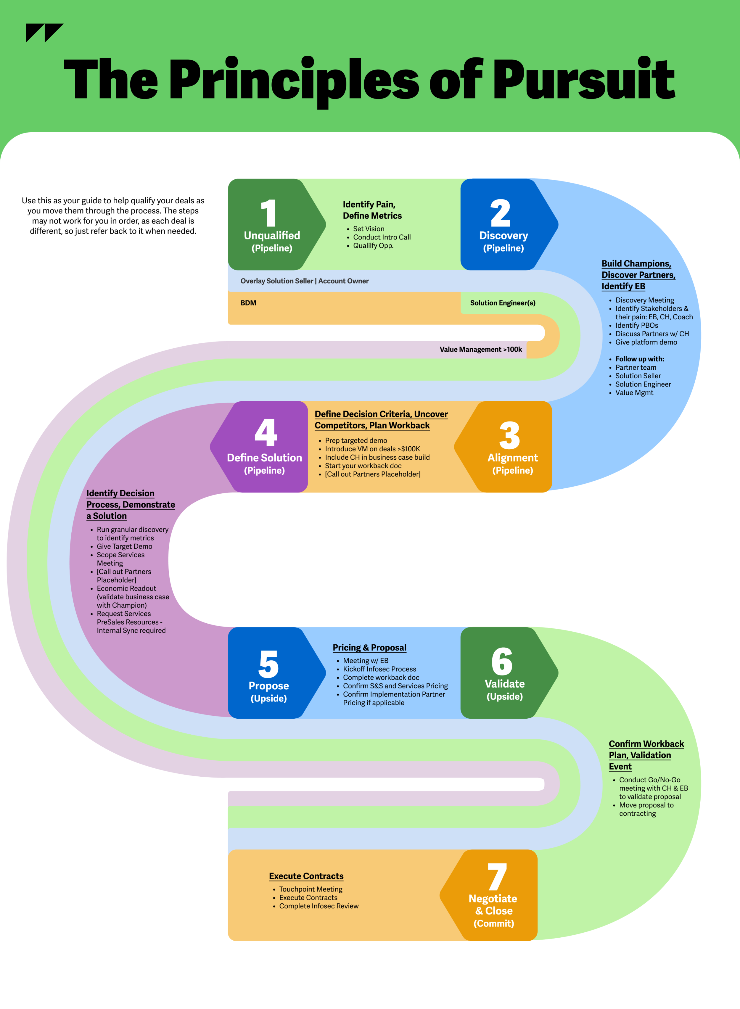
After drafting out gameboard designs, we decided we still definitely wanted to keep the element of a path since the Principles of Pursuit is a selling process where sellers can follow along with each stage. Thus, I reworked the the Principles of Pursuit in the pathway design on the left, simplifying the text even more. When reviewing this design with stakeholders from the Sales Enablement Team, Product Marketing, Sales Managers, and and Sales Team leaders, this design received positive feedback. Top feedback included the visual aspect of the pathway, how much more readable and usable it was, and that this could actually be used the way a cheat sheet/reference guide the original Principles of Pursuit chart was supposed to be.
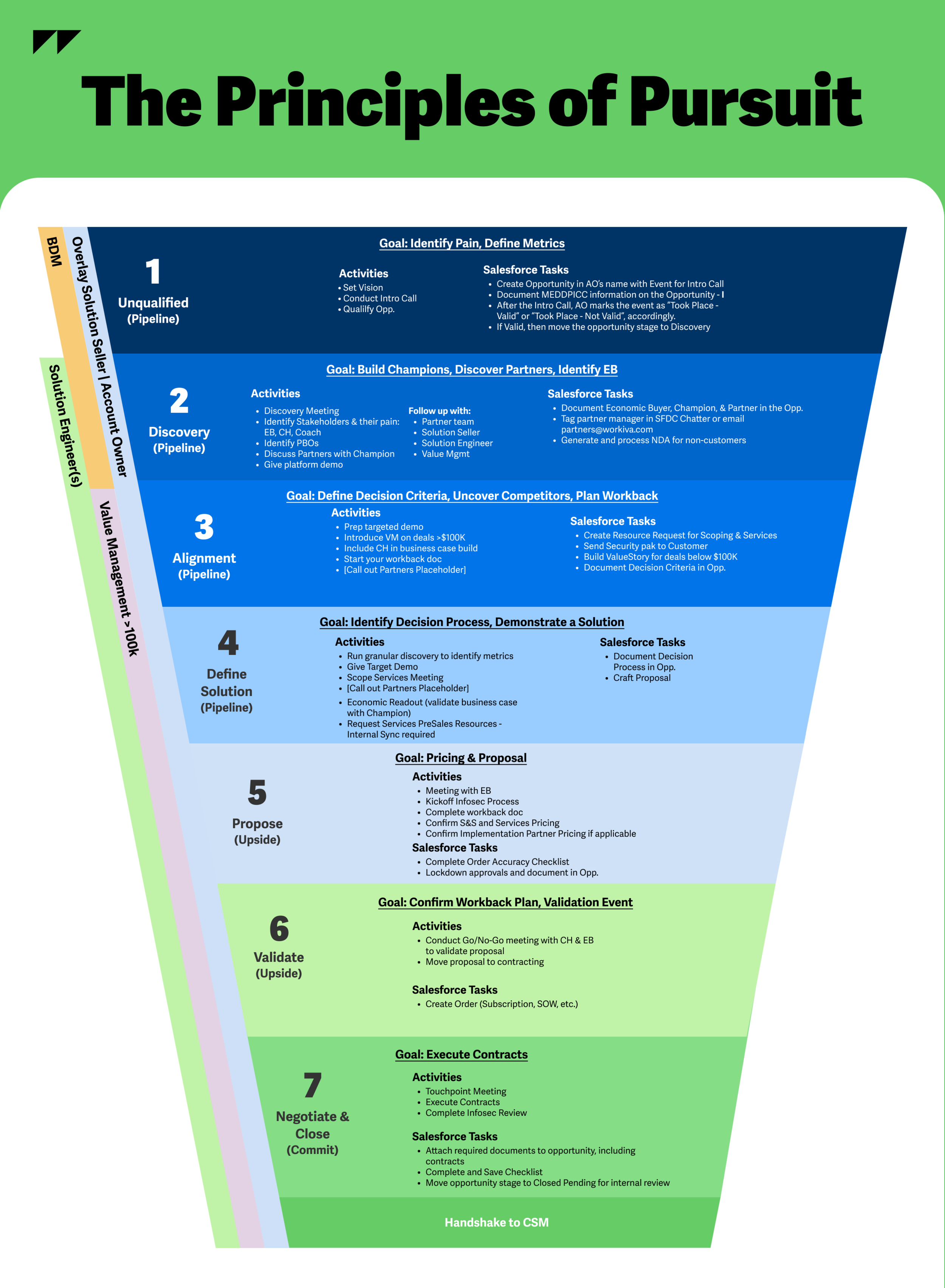
However, one concern a Sales Manager brought up was that perhaps we simplified it a bit too much and asked if we could possibly incorporate the manager questions and Salesforce task information while maintaining the simplicity of the design. Thus, we decided utilizing the back page of the Principles o Pursuit page, coordinating the colors and maintaining readability.

We also created this funnel design to see what the Principles of Pursuit reference guide would look like if we included all the information on one page.
All Design Drafts


Testing and Closing
We tested 1:1 with various leaders and employees on the Sales, Legal, and Training teams using a thought out script as we recorded each test. Using the feedback we received, we adjusted the Principles of Pursuit. My internship unfortunately came to an end before this project closed, but it was an excellent experience conducting user tests, iterations, and continuously incorporating feedback into a design that will be used by the entire Sales Team.