Overview
Role:
Design Team Lead
Web Designer
Photo + Video Editor
Graphic Design
Content Creation
Educational Designer
Deliverables:
Strategy & Positioning
Identity
Web Design
Messaging
Packaging Design
Marketing
Social Posts
Newsletters
Educational Materials
Time:
Dec 2020 - Present
Tools:
Figma
Illustrator
Photoshop
InDesign
Hubspot
Introduction
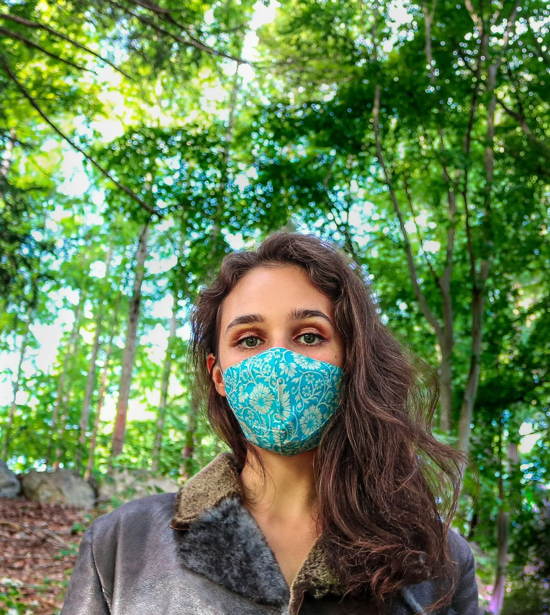
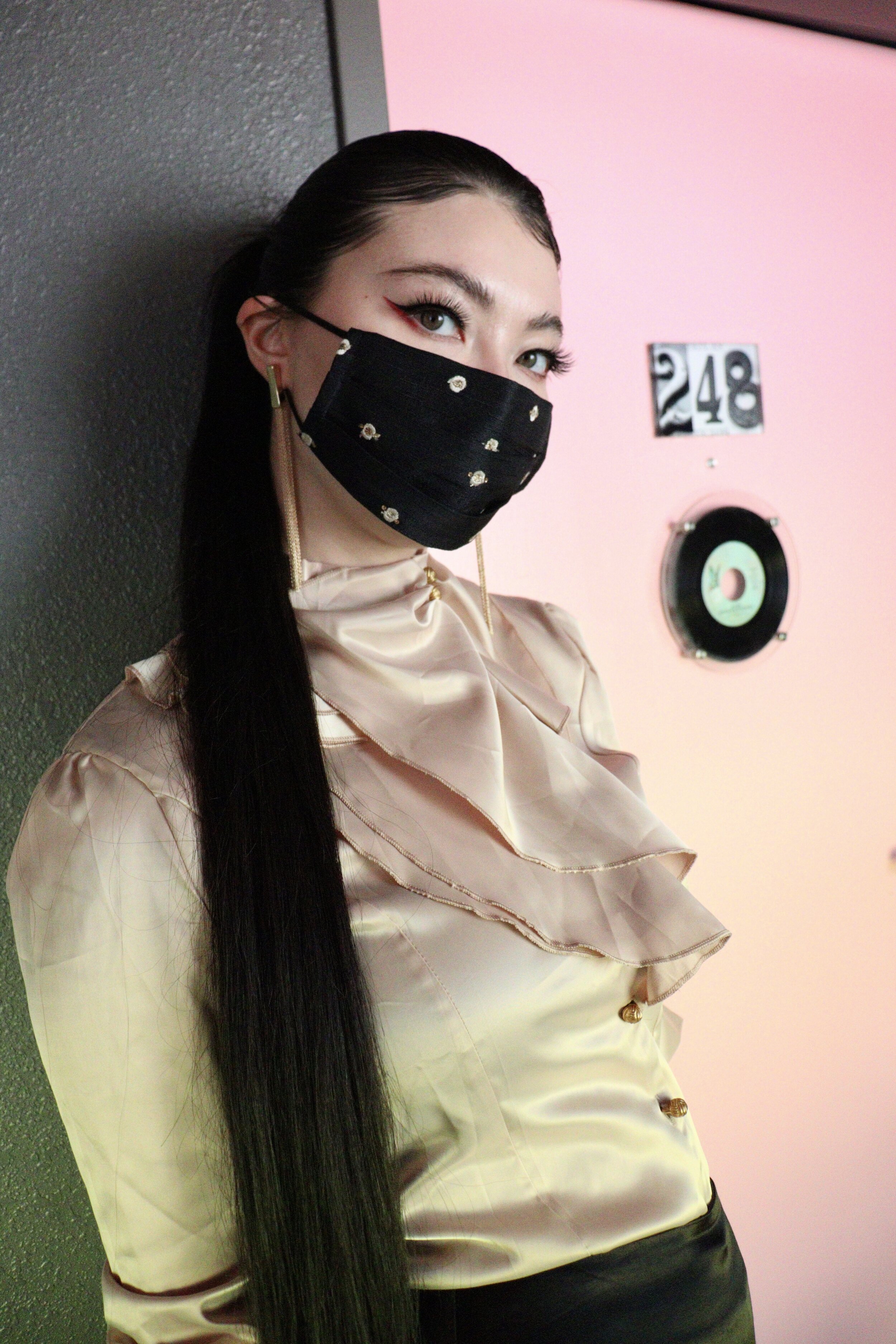
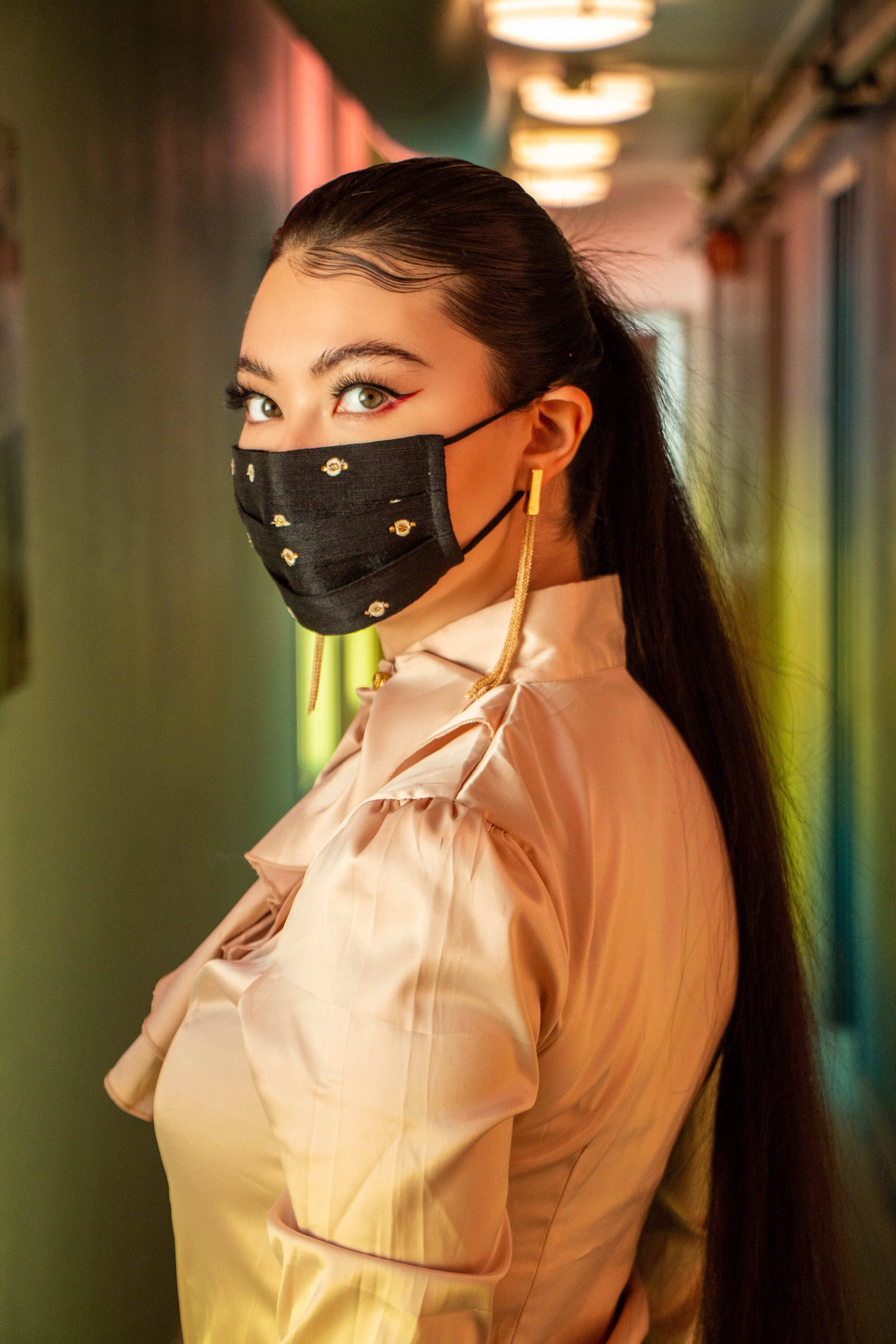
Hope Sews creates ethically produced garments that celebrate artisanal fabrics from around the world.
Their vision is to build a movement where socially conscious fashion fuels women's empowerment—what we call the Hope Sews Ripple Effect. That is why 5% of profits from every Hope Sews purchase goes towards providing hardworking seamstresses and women entrepreneurs in developing countries with the resources they need to achieve their goals.
We are:
Ethical • Feminine • Empowering • Modern • Sophisticated • Duality • High-end • Luxury
Brand Identity

Logo
Expanding the Hope Sews Logo


Print Design

Packaging Cards
This is the final packaging card print design. The left image (the front side of the card) is fabric from the Hope Sews Ghana collection. While I considered placing the Hope Sews logo on the front side or keeping it more black and white, one of the strengths of Hope Sews is the bright and vibrant fabrics it sources across the globe. Thus, I wanted to hone into this and display these gorgeous prints and with each collection that is released, rotate the fabric print being used so that customers could collect these tags, further encouraging them to purchase more Hope Sews products in the future.
Furthermore, we chose to emboss Hope Sews, the headers, and the sewing machine to achieve the luxury and high-end brand tone.

Sticker Designs
I drafted 25+ sticker designs, and here are some of the top designs we considered. The goal behind these stickers is for customers to stick these on water bottles and laptops, and we wanted to come up with a design that would advocate for ethical fashion while being unique to other stickers. Below are the final designs that we considered.


Website Redesign
The Old Website Design
Issues with the old website:
Inconsistent spacing and fonts
Off brand salmon pink color
No color scheme + color clash
Text heavy
Too much noise + overwhelming visuals
responsive sizing issues
Old Website Design Issues

This is screenshot from the old homepage. The sizing is off, the buttons are inconsistent, and there are too many colors clashing with each other.

This footer’s spacing is off, the salmon pink that is supposed to be the accent color for Hope Sews comes off more colloquial than intended, and if one looked at the header of the website, it would seem as though they came from two different websites.

Hope Sews had a collection of sketches made by an illustrator, and although the sketches were nice, forcing the sketch on a banner for the product page did not fit. Additionally, it is not even obvious that this is a product page because the title is misleading and the tan color makes the Hope Brand seem more artisanal rather than luxury.

This image is also from the Product Page where three completely new colors are incorporated poorly. Once again, there are just far too many colors and because there are so many, it takes away focus from the product itself which is bad for Hope Sews.

Lastly, the font and spacing were inconsistent throughout the entire website, making it seem unprofessional and amateur.
The Redesign
When I joined the team as a Design intern, the mask launch was only a few weeks away which was not adequate enough time to move the entire website a different site builder and redesign it along with the more pressing design tasks I was asked to do. However, to get the website looking in better shape, we fixed spacing, colors, and got everything looking more consistent for the Mask Launch. Despite the time constraint, the website aesthetic and readability was improved in time for the Mask Launch.

One advantage of Hope Sews being a start up is that we had the liberty to change the design. We got rid of the salmon pink color and used black and white as a foundation to simplify and emphasize Hope Sews’ product photos.

We cleaned up the footer so that it was aligned and more modern.

We made the buttons more simple and consistent across the entire website and once again, used black and white to highlight the boldness and brightness of Hope Sews photos.

We also slashed any one-off colors and improved readability by making text box highlights simpler and since these are located on the product pages, we made them squares so that they would align with the photo grid.

We made the fonts, spacing, and sizing uniformed across the entire website and incorporated visual elements to make content more engaging.
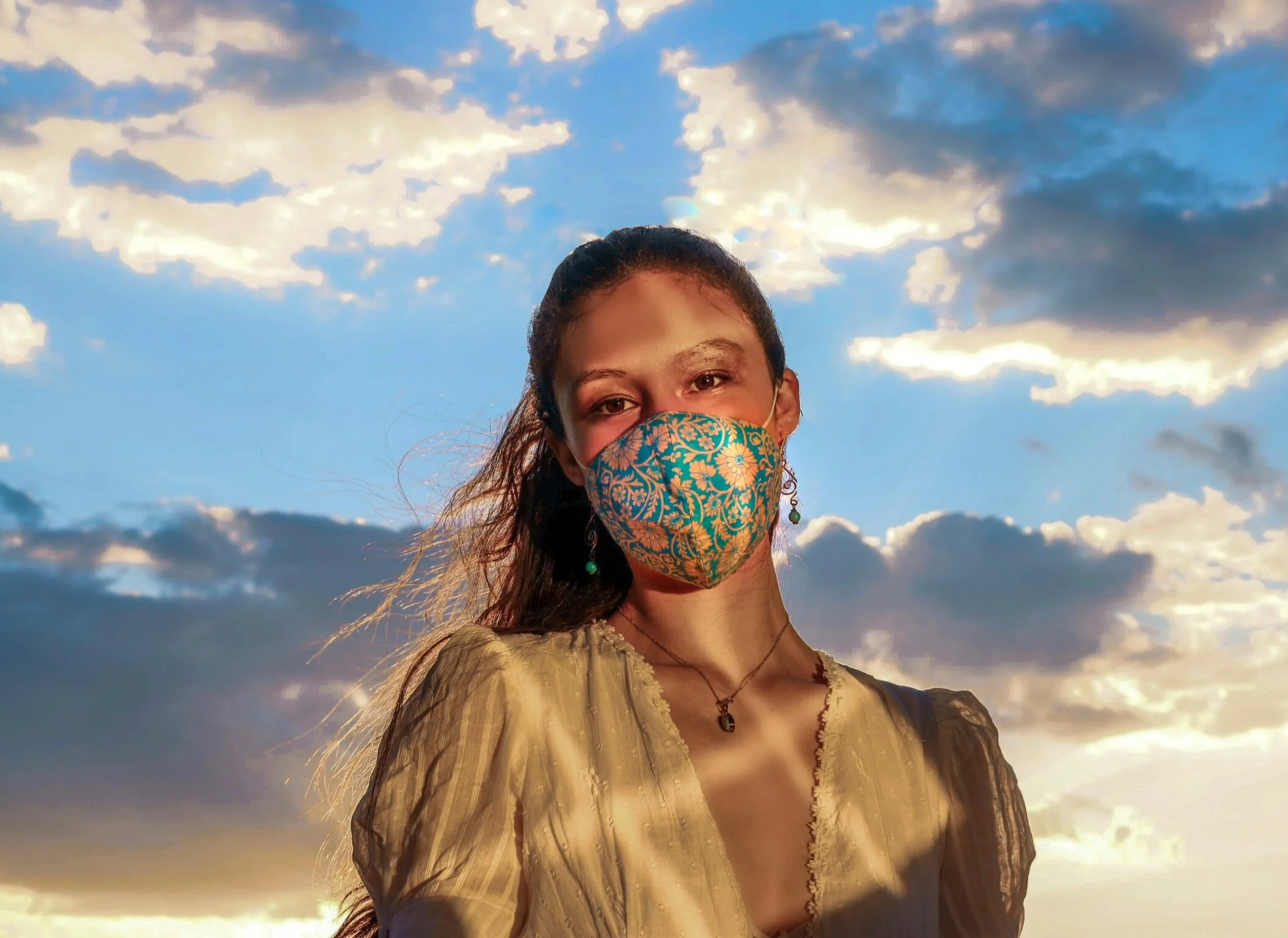
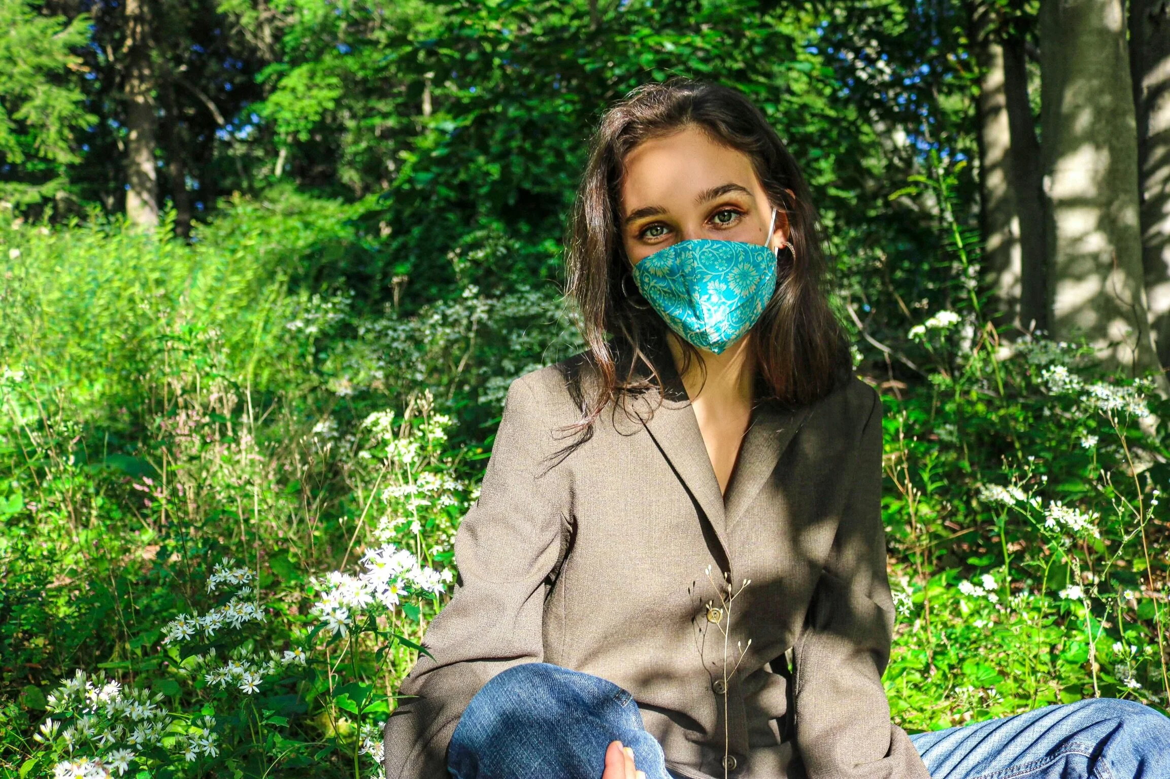
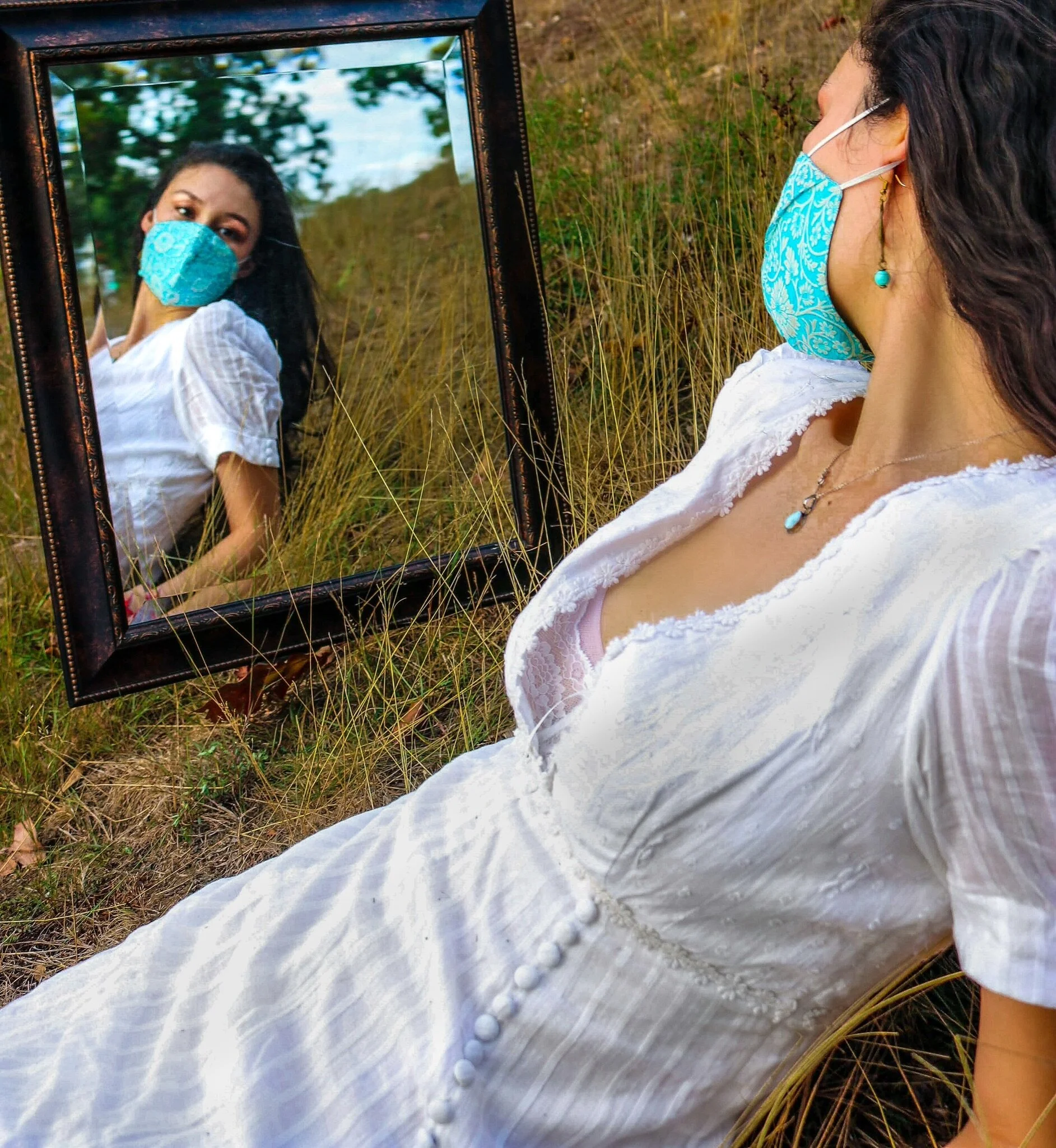
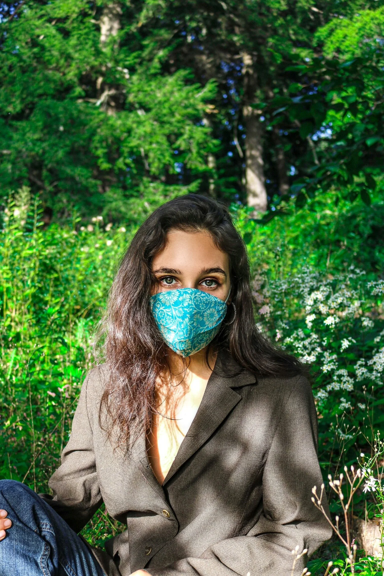
The Photo Edit
Photos I edited using Lightroom and Photoshop.