Ultifi Landing Page
Creating the landing page for General Motor’s new end-to-end software platform that wirelessly delivers software to improve the vehicle ownership experience and deliver new features.
Build:
Role: UI/UX Designer
Team: General Motors Digital Business Technology Team
Tools: Figma, Jira, UserTesting.com
Timeline: July 2022 – May 2023
Ultifi represents a substantial project within General Motors, comprising various intricate components. Given the complexity of the project, I have chosen to concentrate specifically on the detailed process of creating the landing page for this case study.
Overview
Introduction
As Ultifi emerges as General Motors' innovative developer portal, strategically facilitating seamless access to vehicle, cloud, and mobile functionalities, the focus remains on rapid content deployment and fostering robust business collaborations. Joining the expanding Ultifi team, my role centers on ensuring cohesive and efficient user interactions. Collaborating closely with developers, project managers, certification teams, marketing, legal, and UX researchers, I led the design efforts for critical components such as the landing page, creation loop, registration process, and admin board. This initiative is integral to Ultifi's overarching objective of empowering users to effortlessly craft their applications for vehicles, contributing significantly to our shared goal.
The Challenge
Our challenge was to create a developer portal that streamlines app creation for programmers of varying experience. A key challenge we confronted was shaping the creation loop to be user-friendly for novice developers without overwhelming them, while still offering advanced functionalities for experienced programmers to create more sophisticated apps. Moreover, facilitating the official publication of user-created apps, making them available to the public, presented an additional challenge. This involved intricate coordination with certification and legal teams, navigating the complexities of aligning with diverse requirements from multiple teams.
In response to the dual challenge of catering to both novice and experienced programmers within our app creation process, we implemented a dynamic and adaptive design for the creation loop. This approach ensures a user-friendly interface for those new to development while providing advanced features for seasoned programmers. By carefully balancing simplicity and sophistication, our goal is to empower all users, regardless of their experience level, to seamlessly navigate the app creation journey.
To address the complexities of official app publication, we established a robust collaboration framework with certification and legal teams. Through streamlined communication channels and meticulous tracking systems, we are adept at managing and fulfilling the diverse requirements from these teams. This ensures a smooth and compliant pathway for users aiming to publish their apps, making them accessible to the wider public
The Solution
User Analysis
We collaborated closely with the UX Research and Customer Experience team, conducting interviews with software developers through UserTesting.com.
Takeaways from User Interviews
In the series of interviews conducted with seasoned software engineers, a recurring theme emerged regarding their extensive experience with other leading platforms such as Google and Spotify. This user cohort brought a wealth of insights and expectations, having navigated various software landscapes for their diverse needs.
One notable aspect highlighted by the interviewed engineers pertains to their appreciation for streamlined processes observed on software developer platforms. They emphasized the efficiency of workflows, underscoring the importance of a system that minimizes friction and optimizes the overall user experience. This sentiment reflects a collective user expectation for a developer portal that is not only powerful in functionality but also streamlined in execution.
Furthermore, respondents consistently commended the user-friendly interfaces found in platforms they were accustomed to. The intuitive design of these interfaces was particularly praised, indicating a strong user preference for systems that are easy to navigate and require minimal effort to achieve tasks. This insight places a premium on the design of the developer portal, suggesting that an intuitive and user-friendly interface will be key to user satisfaction.
A snippet from our user interview notes.
Turning attention to the analysis of landing pages, software engineers expressed a desire for clear navigation akin to what they experienced on platforms like Google and Spotify. The consensus among users was that a landing page should serve as a gateway to seamless interaction, allowing them to swiftly access essential information or functionalities. Moreover, positive remarks regarding the aesthetic appeal of landing pages underscore the importance of a visually engaging design, emphasizing the role of aesthetics in shaping the users' initial perception of the platform.
In terms of feedback received, the desire for efficiency resonated strongly. Users expressed a keen interest in a streamlined developer portal that minimizes unnecessary complexities. Specific insights were provided into the creation loop and registration processes, where users emphasized the need for an intuitive design to cater to both novice and experienced developers effectively. Additionally, users shared feature requests inspired by their positive experiences with other platforms, signaling an opportunity to enhance the developer portal based on successful industry practices.
In conclusion, the user analysis gleaned from interviews with software engineers underscores the importance of efficiency, intuitiveness, and clear navigation in the design of the developer portal. Aligning with user expectations established by popular platforms, the insights garnered provide valuable direction for refining the user experience and functionality of the Ultifi developer portal.
Competitive analysis of other developer portals.
Personas
Ideation + Wireframing
General Scenario
While this represents the comprehensive site map for Ultifi, our current focus is solely on the refinement of the landing page.
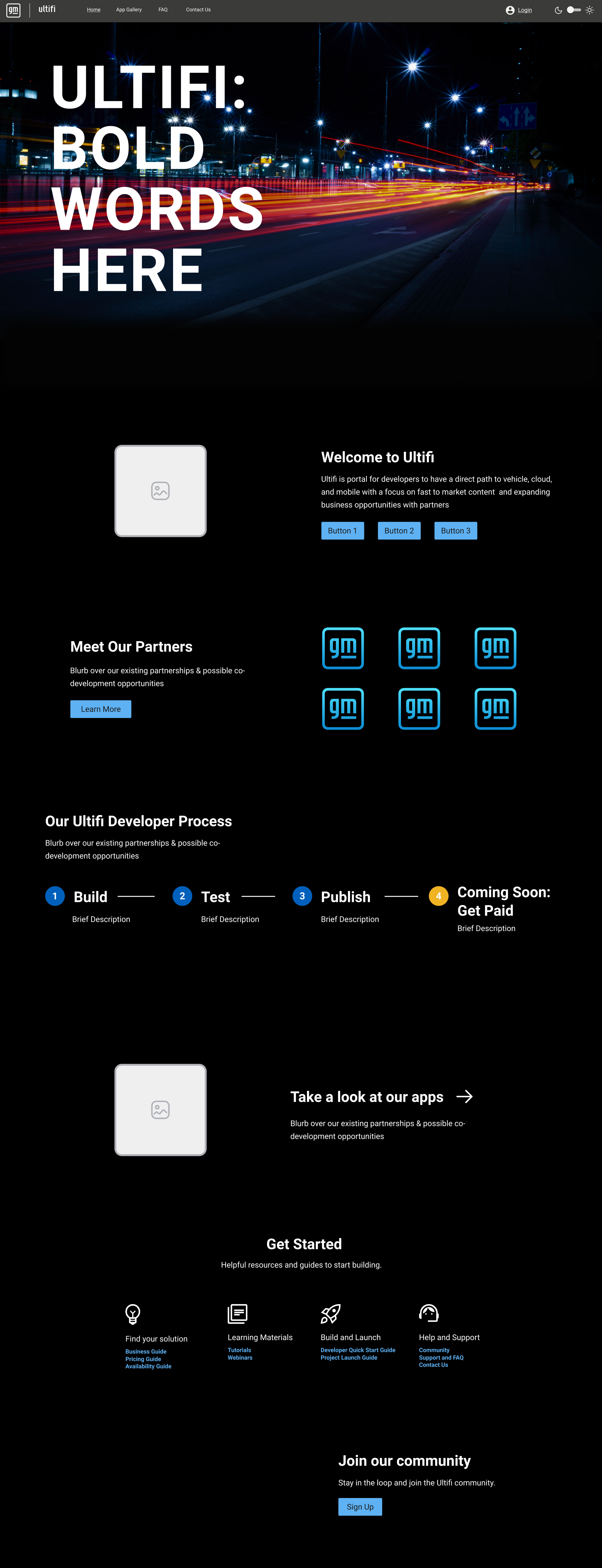
Derived from insights gathered through user interviews and a thorough competitor analysis, I created five distinct wireframes. Subsequently, a collaborative session involving project managers, developers, and business partners was conducted. This session aimed to identify the strengths and weaknesses of each wireframe, leading to the selection of an approved wireframe that serves as the foundation for future iterations of the design.
Next Iteration of Designs
Design Rationale
The decision to craft a modern-looking and simple landing page for Ultifi stems from a deliberate strategy aimed at optimizing user engagement and experience. In today's digital landscape, users are accustomed to interfaces that are not only visually appealing but also effortlessly navigable. By adopting a modern aesthetic, we align Ultifi with contemporary design trends, fostering a sense of relevance and innovation.
The simplicity of the landing page design serves a dual purpose. Firstly, it caters to the needs of both novice and experienced users. A clean and uncluttered interface ensures that information is easily accessible, minimizing cognitive load for users exploring the platform. Secondly, simplicity contributes to a faster and more seamless user experience. Users can quickly grasp the purpose of the page, enhancing the overall efficiency of their interaction.
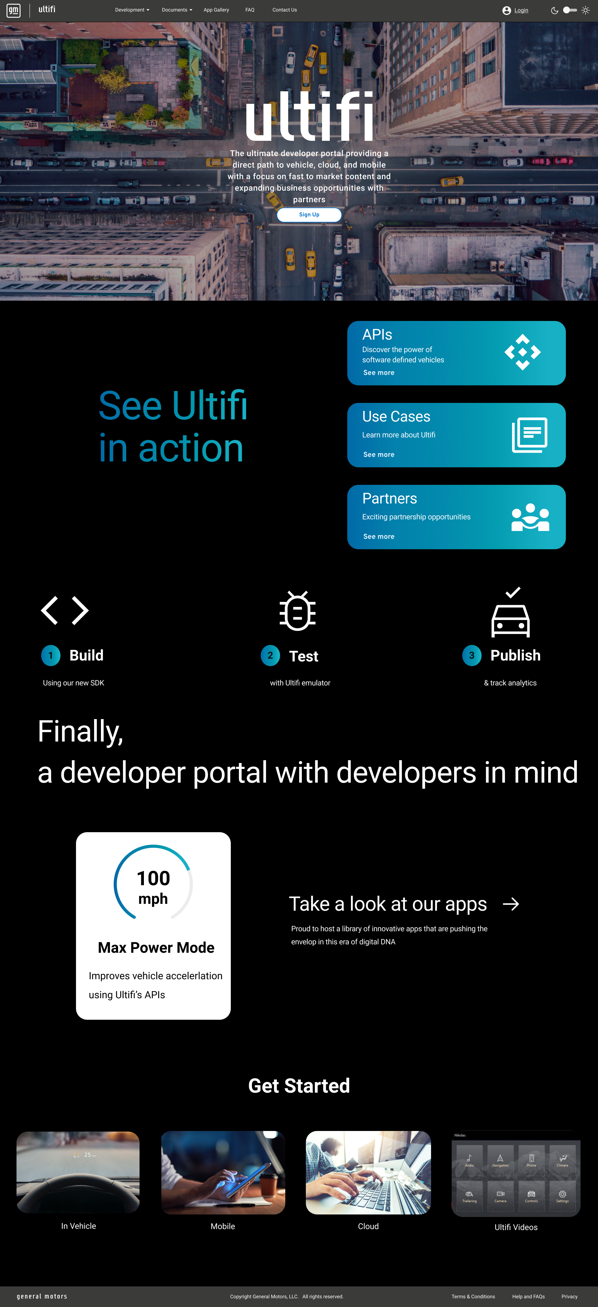
Moreover, a modern and simple design aligns with the broader branding objectives of Ultifi. It communicates a forward-thinking approach and reflects the platform's commitment to user-centricity. By prioritizing a visually appealing, modern, and simple landing page, we aim to not only capture user attention but also to convey a positive and lasting impression, ultimately contributing to the success of Ultifi in a competitive digital landscape. My UX design colleague and I crafted high-fidelity iterations drawing inspiration from current landing page trends, competitive designs, and the latest findings in UX research.
Design #1
Design #2
Design #3
Design #4
Design #5
Design #6
Design #7
Design #8
Design #9
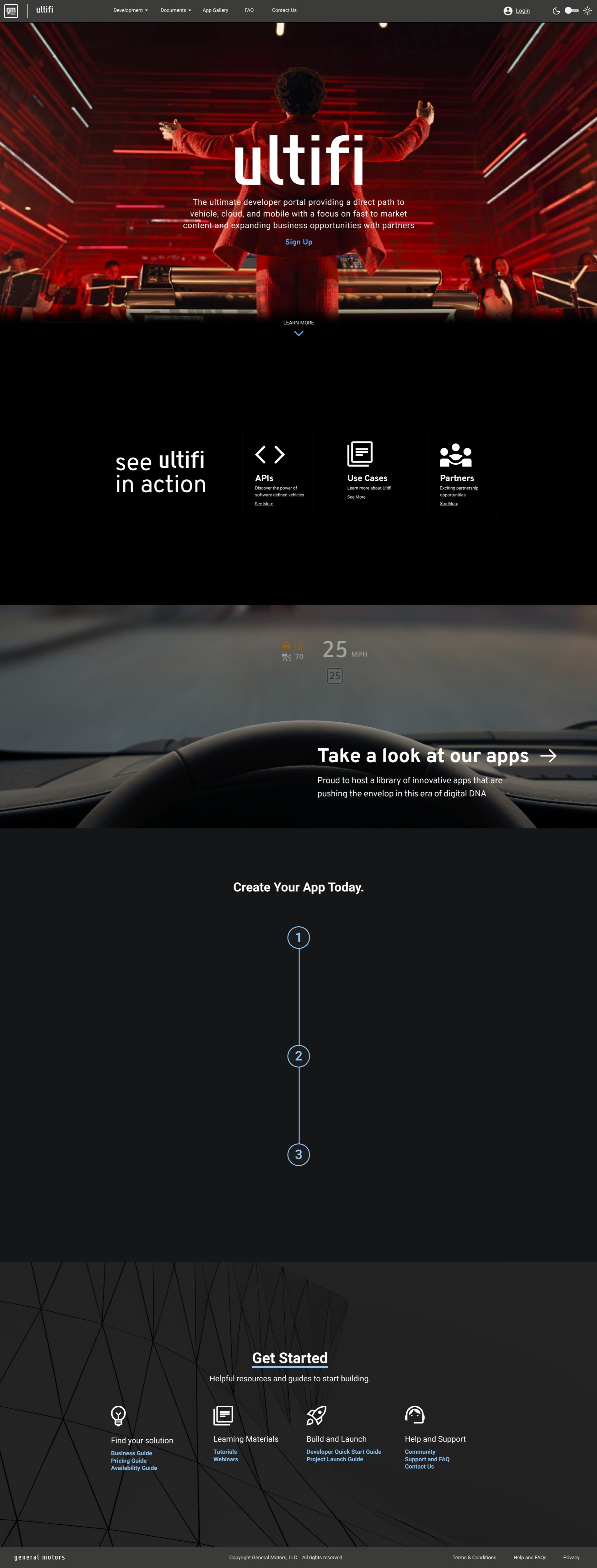
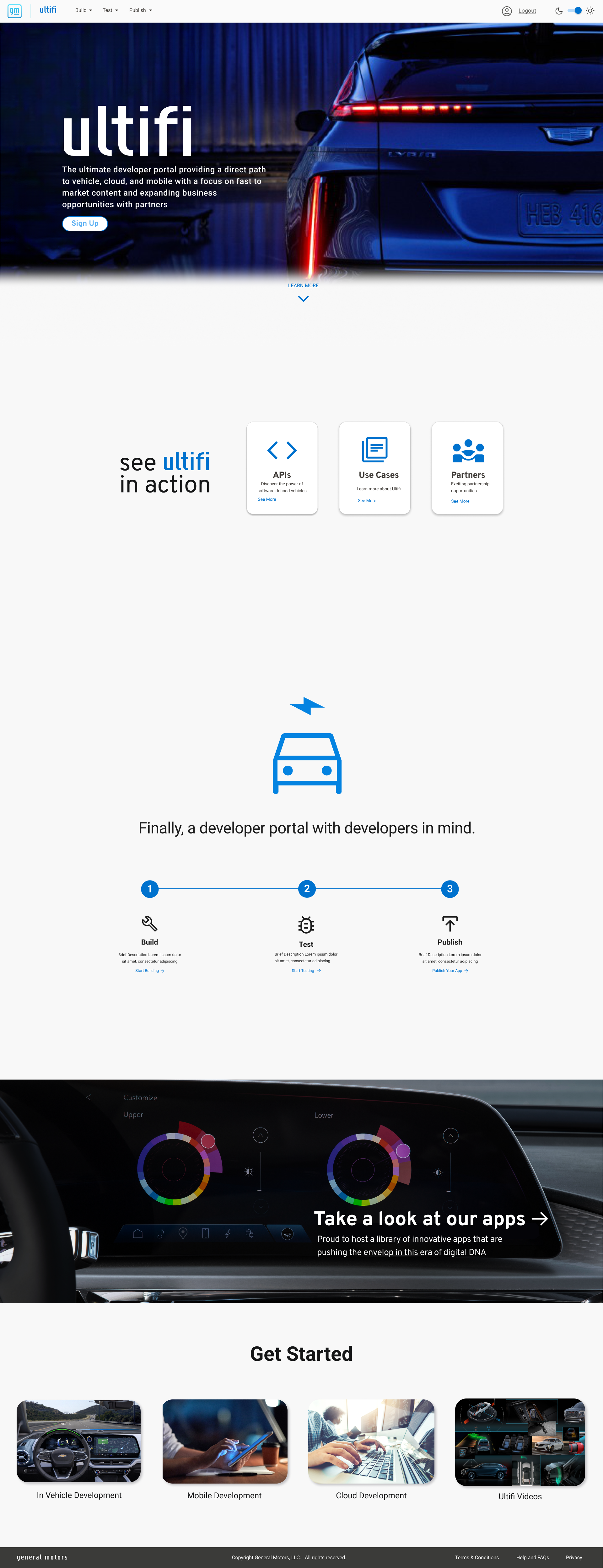
Current Design
In the process of selecting the final design for the Ultifi landing page, my UX design colleague and I conducted a thorough review of the drafted high-fidelity iterations. We sought to combine elements that resonated well with our preferences and align with contemporary design principles, as identified through our analysis of landing page trends, competitive designs, and the latest insights from UX research.
One notable decision that emerged during our collaborative evaluation was the introduction of a light and dark mode for the landing page. Recognizing the prevalent preference among developers for working in dark mode, we aimed to cater directly to their needs. This dual-mode functionality not only enhances the visual appeal but also addresses the practical aspect of accommodating users' common working preferences.
Additionally, we ensured that the final design honored the existing General Motors style guidelines. Consistency with the overarching brand identity is crucial, and our design integrates seamlessly with the established visual language of General Motors. This approach not only reinforces brand cohesion but also ensures a unified and recognizable experience for users across various touchpoints.
To refine our design further, we actively sought feedback from key stakeholders, including the marketing team and the head of our organization. This collaborative process allowed us to gather valuable insights and ensure that our design not only aligns with UX principles but also meets the broader organizational objectives. Their perspectives provided additional layers of refinement, enhancing the landing page's effectiveness in communicating the brand message and achieving our overarching goals.
To further enhance the user experience and infuse a sense of modernity, we incorporated a variety of on-hover and on-click effects. This interactive approach was deliberately chosen to create a dynamic and engaging interface, aligning with the sleek and contemporary feel we envisioned for Ultifi. These effects not only add an extra layer of sophistication but also serve to keep the user engaged, contributing to the overall user satisfaction and the platform's aspiration to deliver a cutting-edge experience.


